Nails Nails Nails
Hi, everyone! 🙂 sorry for being MIA for a bit.
So I was going through my camera memory card, and noticed that I had taken a lot of nail photos during the past month or so. Here are three that I’ve managed to put together.
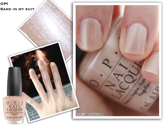
OPI – Sand in my Suit
It’s a nude sandy shade from the South Beach collection. When applied, it actually does look grainy and sandy :p It’s a bit frosty and looks almost like an extension of my skin color (MAC NC20, yellow undertones) on my nails.
I wouldn’t say it’s flattering to my skin tone, but I wouldn’t say it’s an awful color.

Application: a bit streaky, sheer, leaves some brush marks
Pigmentation: weak
Layers needed for full coverage: at least 3 coats
Lasting power: 2-3 days with top coat.
Overall: 3.5/5
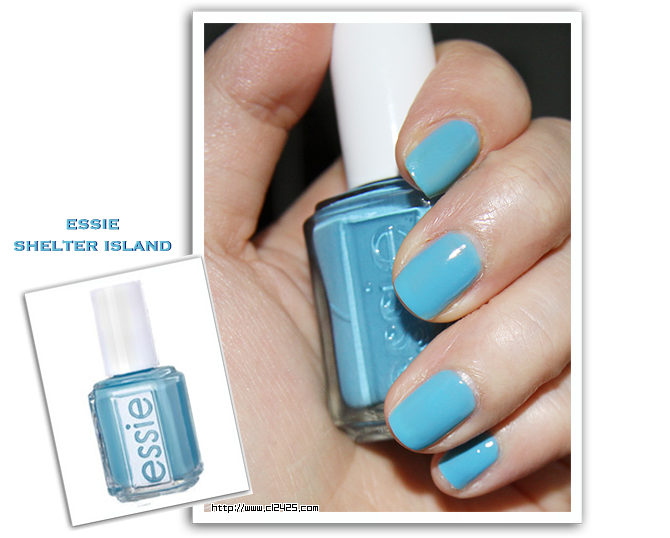
Essie – Shelter Island
Shelter Island is a blue creamy shade that was part of the North Fork Collection. I thought this was going to come out a bit brighter and in a fresher tone. But the blue shade isn’t that flattering when applied. I think if it was a bit brighter, it would have been a great spring/summer color to wear.
Maybe it’s just my yellowness around my fingers that bounces off the color in a dark way, but the color truly stands in a very odd spot. It’s not perfectly blue, a bit too dark to be sky blue, too light to be ocean blue, too blue to be greenish blue… it’s just a very ambiguous blue.

The color on the camera actually came out very vibrant and minty-fresh, but the color in real life is more like the essie bottle color on the left. Just think of the color toned down with a bit more of grayish tint to it.
Application: a bit watery, but creamy and smooth
Pigmentation: Medium
Layers needed for full coverage: 2 coats is more than enough
Lasting Power: 3 days with top coat (doesn’t chip easily, but does tend to peal off)
Overall: 3/5 (that’s how much the color is dull blue)
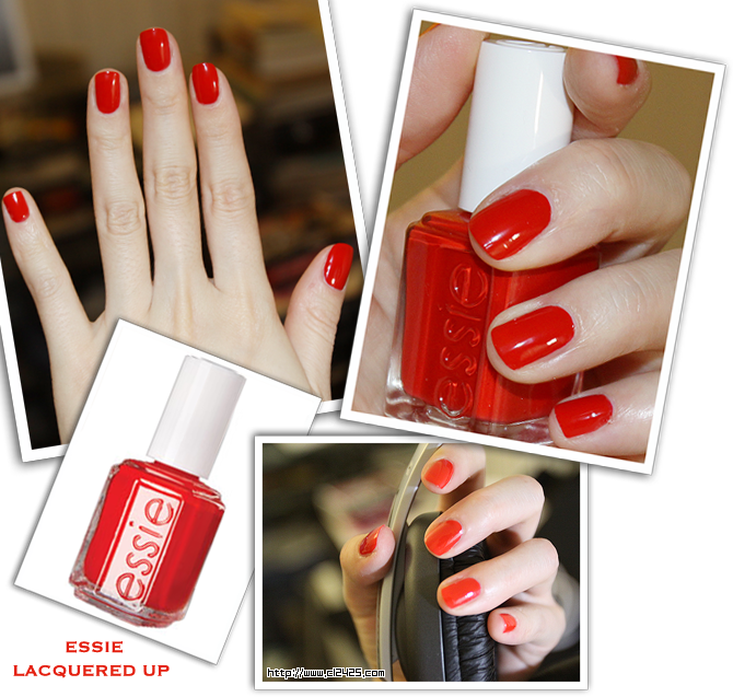
Essie – Lacquered Up
I think it was part of essie’s spring 2009 collection. I usually look really old and weird with red nails, but this color is SSSSSOOOOOOOOOOOO pretty and flattering! It’s like a bright bright, super glossy tomato (or chili pepper) red, which makes your hands look youthful and fun.
I don’t like nail colors that make my hands look dark and dirty, but this one actually lightens up my hands 🙂 yay!!

Application: Creamy and thick
Pigmentation: Strong
Layers needed for full coverage: 1 coat is enough
Lasting power: 3-4 days with top coat (doesn’t chip, but does peal)
Overall: 5/5
Alright, I’ll try to keep you guys up with what nail colors I’m trying out. After my initial “OMG, I’m falling for nail polishes!” phase, I have gotten worse. I can’t seem to stop buying nail polishes x( The reason why I’m not posting haul posts every time I buy something is because I feel obligated to do swatches and initial reviews, and what can I say :p I only have ten fingernails and initial reactions and reviews after usage are often conflicting.
But hope you guys enjoyed the tiny reviews. I’ll try to keep them coming 😀
 Oh! and btw, did you guys see Ugly Betty ending last week? :'( So sad ABC had to sabotage the show by moving it around. I was a huge fan of UB from the beginning. The colors, the fashion, the hair, the characters were so fun to watch. I loved all the ladies in the show (Amanda, Wilhelmina Slater, Hilda, Christina and even Claire!!). They were so fashionable, fabulous, gorgeous and fun to watch. My favorite was Amanda and Wilhelmina since both came off initially as bitchy and mean, but turned out to be people with warm (or at least a bit of) hearts. And I loved both of their over-the-top fashion sense 🙂
I loved the ending song (UB always seems to end episodes with good songs), so if you care to listen here’s the song 🙂
It’s Macy Gray’s Beauty in the World
Have a fab day!
Catalina

Ana Kessel
Actually even though the first color is really nude i think it looks fine since it matches your skin really well . And I love the red polish,its kind of hard to find red colors that are true bright crayon red, that one looks perfect 🙂
emimonster
i really like the first color! it looks very neutral and natural yet has a bit of frost/color. im gonna check it out next time im at a beauty store. thanks!
*Anita*
pretty colours! i actually think the first colour looks great on you! i like how it has some subtle frost to it but isn't overly sparkly 🙂 xx
Edwina
haha i just read the comments above me, and i have to agree, i like the 1st colour too! probably because i'm such a nude nail polish junkie :S anyway, great post!
Silkybow
I like the first and second colour a lot!
The red looks really good on you~
Jessica
i am the same with nail polishes…i like colors that make my skin stand out and look brighter, not weird and dull which is hard with yellow undertones! i have similar a skintone to you, i think, (nc 20) and i really like how the color mint candy apple by essie looks, if you haven't tried that already. 🙂 always gets compliments. hope you post more nail stuff, because i am hopelessly addicted, too. :'( haha.
everyday
Hey Catalina!
I have two questions, where would you buy Essie or China Glaze nail polishes? I can't find them in any of my nearby stores!
And my second question is do you prefer OPI or Essie nail polishes?